Recently while editing a coworker’s Tridion documentation I was shocked to see him refer to the Structure Group icon (pictured below) as purple. As someone who considers themselves to be somewhat of an expert on the Tridion icons, I was blown away to hear this one referred to as anything besides pink.
Now, as an editor I’m fairly conservative, and don’t like to correct people based on my personal opinion, so I decided to confirm the colour of this icon with a few of my coworkers. The results were…mixed.
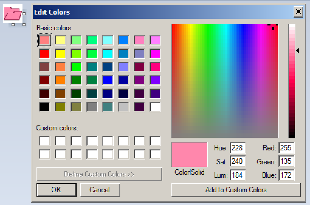
Obviously this purple nonsense is at least somewhat pervasive, so I needed to dig a little deeper. Using the eyedropper tool in good old Microsoft Paint, we can see that the colour of the icon is rgb(225,135, 172), which translates to #FF87AC.
What do we know about this colour? First, Encycolorpedia lists this colour as a “light pink”, which is a big win for the good guys. Everyone’s favourite knowledge engine, Wolfram Alpha, tells us that the nearest named HTML colour by variation of RGB values is “Hot Pink”, and that the nearest brand colours are “Benjamin Moore 1326 (bubble bath)” and “Benjamin Moore 2000-50 (blush tone)”.
So, after this exploration, I think we can conclusively determine that the structure group icon is pink, or perhaps bubble bath or blush tone, but certainly not purple.


I have a suspicion that this idea crept into our culture back in the days of Tridion R4. I went looking for a screenshot of an R4 system to see if I could confirm that the structure group icons were somewhat more purple back then. Unfortunately, the only example I found was only displaying folders and not structure groups. This may possibly remain a mystery until the end of time.
Pingback: Why we can’t conclusively determine that Tridion structure group icons are pink | Frank M Taylor
This is a good theory Dom. I have no excuse for the writer of the original docs that spawned this post, he’s never seen a version of Tridion before 2013 😉
It’s confused by the existence of a border/highlight color, which looks to me to be magenta and tricks the eye into thinking the icon is something other than plain old pink…
In my mind, the Structure Group icons started off as purple before becoming more pink in later versions. I even used “purple for pages” as a mnemonic to explain what Structure Groups where for. “Pink for pages” still worked as an alliteration.
Anyways, it was almost always an ice breaker and joke to ask trainees and consultants what color they saw when explaining “folders” in the UI.
When making the new (new) user interface for 9.5, at one point we used the same gray color for all the organizational items following the Graphene design standard. During a sprint I couldn’t find the root Structure Group!
One of our developers pointed out why and that colors can help distinguish differences in a UI.
So we shouldn’t rely on color (alone) to convey information to users. But it can help some users, regardless of the specific RGB value.