Summary:
I know time’s precious so let me give you the summary – read on for the rationalisation!
An RTF field is exactly that – a Rich Text Field – it was never intended to facilitate how the combination of text and images are presented across multiple views in different devices; that is what we use CSS, HTML, JS and-the-like for.
Control’s important and should be in the hands of the people with the tool for the job. Tridion is an excellent content management system and affords editors with a multitude of tools to manage content across hundreds (if not thousands) of publications.
Change can be difficult but it will constantly happen in the digital world. As quick as a design is finished we’re testing and improving it – this calls for specific design frameworks and tools to be employed – an art best left to the front-end team.
So, What’s all this talk of RTF abuse?
“Why do we need an image component link [specific title field etc.] rather than just throwing the image [contnet] in the RTF†is an all too oft-cried question.
The short answer is that we want to control the design – that is, separate content and presentation – yeah – you’ve heard that before, right?
Of course, we want to allow flexibility also (ah you’ve probably heard that more frequently!), and this is important in the decision to allow or disallow functionality that may be problematic as described below.
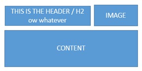
So let’s take a simple design choice like the following. The image is to be aligned to the right of the main page header and the text underneath is to flow around the image.
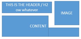
An example where image exceeds the height of the title
Let’s take a simple HTML approach to this for the purposes of an example.
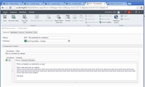
We take a standard RTF with a header. This has a header as we want to explicitly control if this is an H2, H3, or other, and also in the event that it requires an explicit class requested by the front-end team.
Now, given the design, we realise that we must put the image to the right of the text in order to allow the flow to happen – We’ve broken our principle of control of that field. Still, we can have the editor apply a class using the source tab (1) (or using the styles drop-down (2)).
(1) Another aim is to not expose editors to any sense of technical syntax – however easy you think HTML and CSS is… it’s not plain English and, to the untrained, you may as well put in hieroglyphics.
(2) Styles are shared across all publications and the drop-down control only supports one style per HTML element – in a multi-tenanted environment where class names haven’t been built-up with this in mind it falls down quite quickly.
We can apply a specific Heading to the first piece of content – this will be used by the front-end team to assess the float of the header relative to the image.
Of course – without accessing the source tab we can’t apply a specific style to this header so we rely on the CSS team getting the context of it from the container HTML. In our environment, we also can’t use the ‘Style’ drop-down without re-writing the original CSS from the ground up (I’ve wanted to blog about this bugger of a feature for a long time – more to come!).
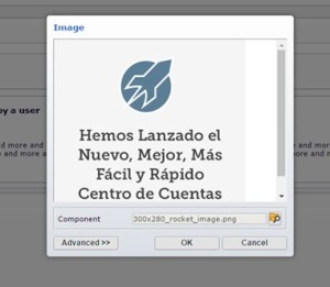
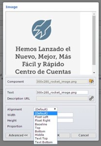
So now we know we need to add the image – we can use the default RTF insert image from the toolbar. As shown above, we can locate the multimedia Item as a component link which is great but we now need to look into the ‘Advanced’ options.
In the Advanced options we can see that the following fields are now entered directly by the editor:
Text – this will be used to populate the ‘Title’ attribute of the image – note that this presents challenges for translation as the title doesn’t belong with the image and can be changed on a per-instance of the image being used in an RTF.
Alignment – Here we will select Float right as this seems to give us the effect we need – noting that this has no impact on the padding to the left or the right of the image (we’re still going to rely on the CSS folks for this no-doubt).
Also, we enter the height and width directly here in addition to determining how the image will be resized from it’s original.
So now we have a view (in the RTF editor at least) that the content is fitting together just how we seem to want it to look. But now let’s consider a couple of things going forward.
Control and Change.
As we stated we want to separate content and presentation. We want the editors and authors to control and change content and we want the front-end team to control the presentation. Of course – there’s an element of cross-over is most systems.
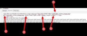
Let’s look at what’s happened to the HTML that will now be output as a consequence of the formatting control we’ve assigned to the editors:
[1] We want the editor to control and change this content – but the question is whether we want it controlled as part of the image or changed from an ‘advanced’ button or a ‘source’ tab. We now have the title embedded in this instance of the content rendering; in some systems, this could be a requirement – in others it could be a requirement to have a consistent title wherever a specific image (of a specific type) is rendered. Given our requirement for consistent – not least to make translation more manageable) this isn’t great for us.
[2] With the alt text we have the same consideration – we want the editors to control this but it’s more a question of when and how we want them to change it. As [1] although you could argue having alt text should be specific to the context in which the image functionality is presented lends itself to this approach if the content were managed to this level which, for good or bad, it tends not to be.
[3] the RTF is now pushing out specific ‘style’ attributes –
In terms of control, we’ve just made this difficult for the CSS team; the CSS team will be promoting classes and proper HTML syntax and not want us adding markup at the highest level of specificity (see more on the specificity of styles at https://www.smashingmagazine.com/2007/07/css-specificity-things-you-should-know/)
[4 /5] The height and width are not only specified at a problematic level in the markup they also have hard-coded px indicators – this will certainly present issues for the front-end team as they try to merge this into their fluid design;
We’ve moved control to editors and made change something very difficult to assess. Ask yourself, if we delegate control of this to editors and an image size is changed at source – would we expect the editor go through each use of the image and address the design consequence by adjusting these manual values later?
The change element is probably better shown through the example of the float: right attribute; whilst this was easy for the editor to assign through the drop-down list provided we’ve built a longer-term challenge. In the event we want to change the design and decide we want these images on the left – this can’t be changed by CSS alone – we now require the editors to find all content that is marked as float: right and change it to float: left – remember that they are now changing content and as such the need to publish and testing / QA requirements also kick in.
Similarly, by proposing the editor controls this aspect of the presentation we are moving away from our controlled classes that will be pushed out as page design to a content level option which also increases the possibility of the wrong options being typed/selected accidently.
And a final one on change … the content presentation itself will change when the user views between different device types in our responsive design; in the editor-driven RTF with the image there is no control over the different views for devices because we’re not relying on classes etc. – we’re relying on the single set of styles in a GUI designed to give a very very basic view of the content. This is a really important aspect given we start to move into the realms of functionality as much as design (does an image stack above, below or remove for mobile etc.) and this is where the CSS/HTML/JS design will really shine through when applied as a separate art to content management.
